Cooper Brouard
Cooper Brouard is one of Guernsey‘s leading estate agents. Their reputation for friendly, honest advice and a highly professional and efficient service, has resulted in steady and sustained growth and as they continue with this expansion, they turned to Hamilton Brooke to help develop their marketing both creatively and logistically.
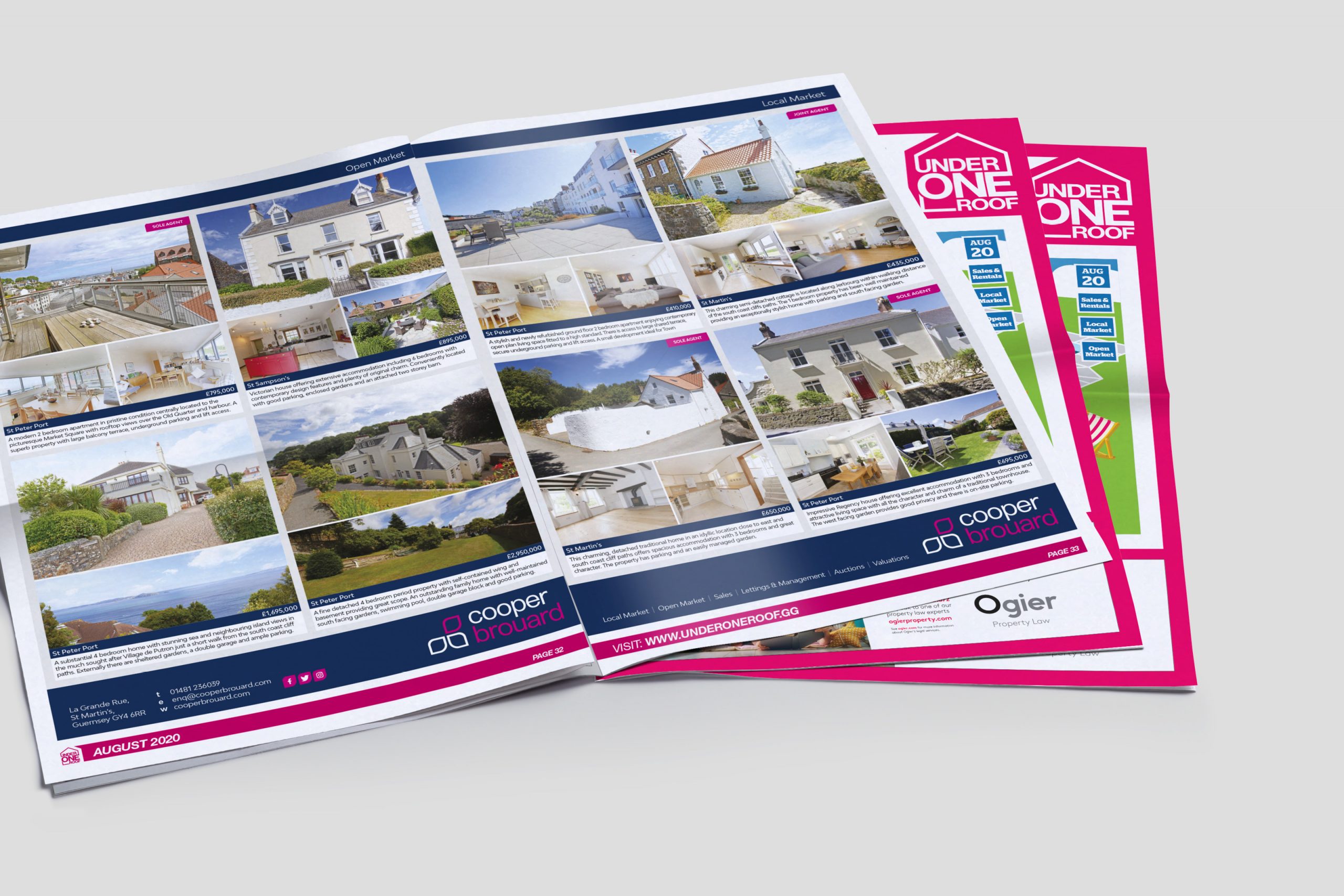
A key element was to establish a new corporate identity, one that reflected the larger and more dynamic business they had become, but also stayed true to their core values of integrity, honesty, approachability and professionalism.
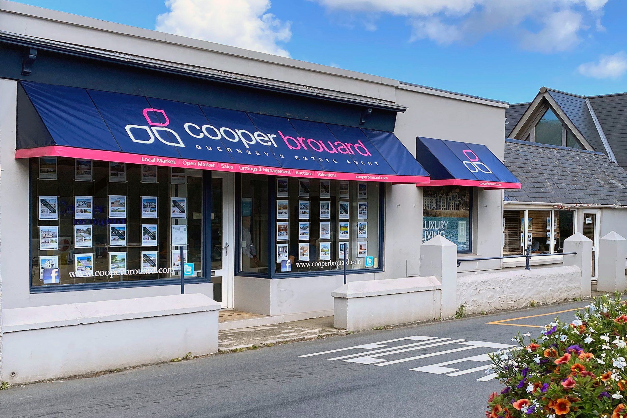
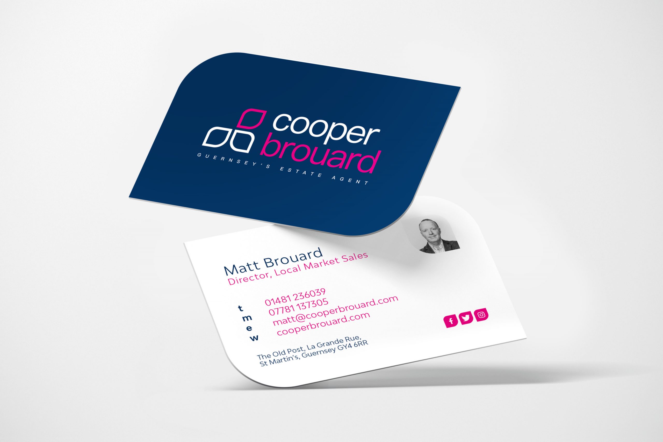
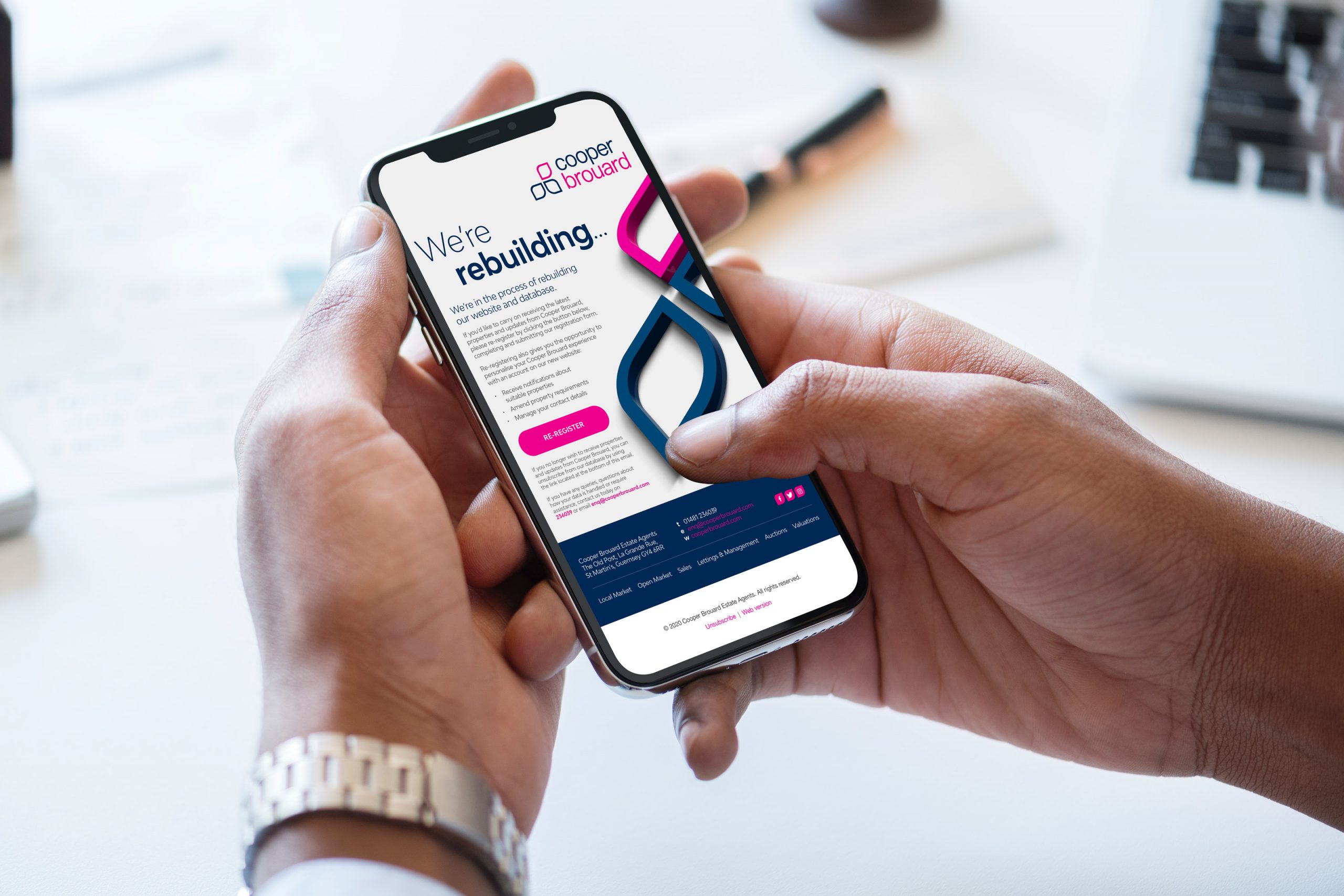
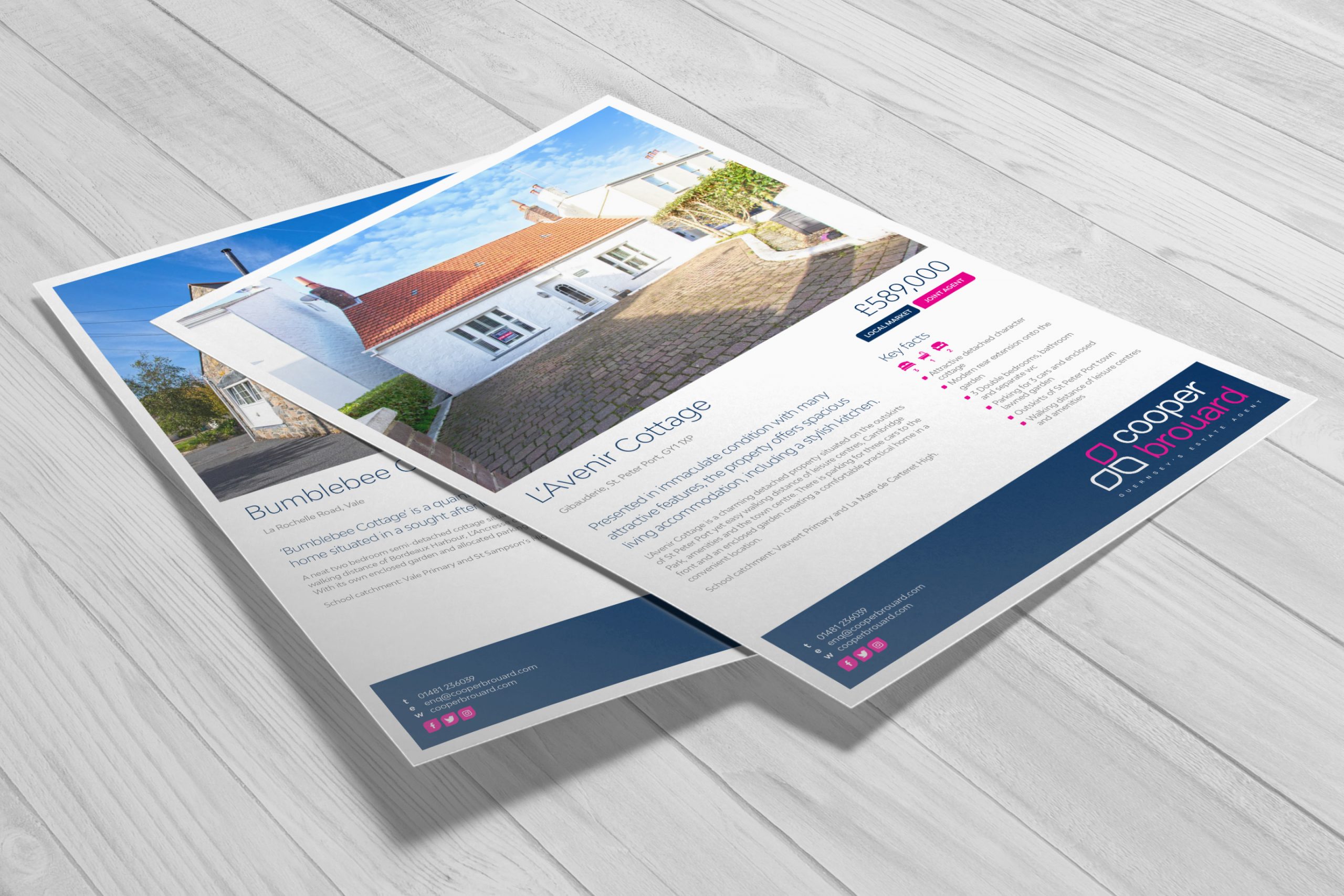
The existing identity was a little dated and somewhat muted, but Cooper Brouard had ‘owned’ the dark blue, in Estate Agency, for many years, so the decision was made to use a blue as a base.
Magenta was brought in to add vibrancy and warmth and together with white it gives a colour palette that is strong and flexible.
The previous gate device was a little forbidding and because of its complexity was hard to discern when reproduced at smaller sizes, so a new icon was developed.
Much bolder and cleaner, the new device loosely echoes the shape of Guernsey. Coupled with a cleaner, san serif font it is contemporary without being pretentious.
The rounded lozenge shape is picked up on throughout the marketing materials to act as framing device to reinforce the brand. Its soft corners are relaxed and welcoming but does not compromise on space.
Key to any brand is its ability to be applied to any situation so stacked and single line versions were developed as were options for light and dark backgrounds and mono treatments. The new identity has now been applied to everything from stationery and signage, print and promotional items to ads and email, with a new website to follow shortly.